I found a handful of well-preserved sites from an older era of web design.
Sonic Team
Sonic Team's website has been updated recently (though not too recently, since it doesn't mention their newest games, nor the latest Playstation/Xbox consoles at all), but it still has links to sites for games dating back to the Sega Saturn generation. Links for the Dreamcast and Saturn are near the bottom of their sidebar, in Japanese.
Here's a few highlights:
- Sonic Adventure, for the Dreamcast, released in 1998.
- A blog from the music team about their trip to a recording studio in New York. Check this one out with Google Translate, it's amazing.
- Photos from the trip
- Space Channel 5, also for the Dreamcast, released in 1999.
- Sonic R, for the Saturn, released in 1997.
- Nights into Dreams, also Saturn, relased in 1996. The footer mentions Netscape 3.0.
- a page about the story with a very 90s era background
The King of Fighters
This fighting game series still has some of the original marketing sites up for its earlier titles.
- KOF 98 "Unlimited Match". I'm not sure when this was made. This is for the 2008 re-release of KOF 98. The copyright date says 2007 and there's a Wordpress logo for the favicon. However, everything else about the website screams It's using tables for the layout and font tags for text colors. I'm wondering if there was an existing site for KOF 98, and they gave it an update for 2008 without changing the way it was written.
- KOF 2000. A great example of how a site would sometimes have completely different layouts for each page.
- KOF 2002
- A general information site about SNK's games, last updated in 2009, but looks like it was designed before then.
Honorable Mention: Team Fortress 2
Team Fortress 2's website, which is the only one on this list that is still the current website for an active game, isn't really that old. And it doesn't look old, either. But I'm including it because it has a few elements that are from an earlier era of web design. It has had some revisions since 2007, but hangs on to those older design choices.
First, the width is not responsive. If you're on a phone, you just see a shrunken down version of the desktop layout.
Also, it has gradients and shadows on buttons: we had not yet flattened the internet in 2007. And check out the Twitter logo — that's the old Twitter logo. Like, the really old logo.
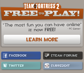
Any text that uses the Team Fortress 2 typeface* is actually an image being added as a CSS background.
The characters in the header use an imagemap to make them clickable, which is something that I haven't seen in a very long time.
There is also an Easter egg. If you inspect the page's HTML, there is a comment just inside of
<div id="primaryHeaderArea">, which is commenting out some divs. If you remove the comment
markers (<!-- and -->) so that the divs show up, it will add a blood splatter next to the
Team Fortress 2 logo and the spy's face will become a skull.


And last but not least, the only Javascript downloaded is for the social media buttons. None is necessary for the website itself.